5 Steps In Designing A WordPress Website For Mobile
Since a large percentage of internet users are from mobile users, it is important to make your wordpress website as mobile responsive as ever in order to cater to these users too. Here is how you can begin designing your mobile friendly wordpress website:
- Prioritise
To help the contents of your website load quickly on mobile phones, prioritise the contents you want shown so that it doesn’t have to spend a longer time loading up everything. This way, the mobile version of your website won’t be so cluttered, and yet can still retain it’s usefulness. Functionality and accessibility should be your focus when it comes to mobile responsiveness (http://wordpresstraining.com.sg/6-benefits-of-responsive-web-design/) .
- Interface
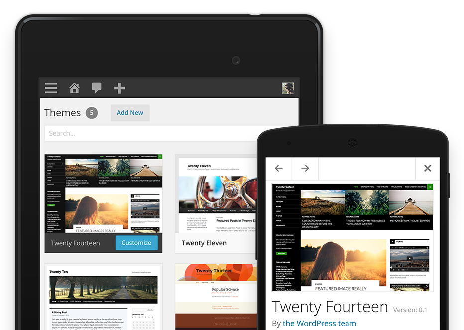
Mobile users should be able to navigate your website in just a few simple clicks or by scrolling instead of having to spend time trying to decipher how to use your website. The contents of your website should be displayed properly on the screen instead of the user having to zoom in, in order to read the text and details.
- Image and Video
If you need to use images or videos, you will have to make sure that the contents are able to be viewed and loaded quickly on a mobile phone- even if it means having to reduce the number of images used or finding a suitable resolution that does not take too long to load. If you are unable, then you may have to consider making your videos shorter.
- Text
Make sure that your text is legible- users should be able to scroll and read through the words without having to zoom or squint. Make sure the placement of the words are in correct order too, with a suitable size and word spacing per line. Make sure to test everything out before making your website live.
- Aesthetic
Pay attention to your website and check it through different mobiles regularly to ensure that everything is placed well and designed to the T. If you have to, you can even pick up some simple coding to make simple changes yourself instead of having to waste time getting your web designer to solve a problem that can be changed easily.
By making sure you are able to achieve these points, you will be able to create a functional and good wordpress website (http://wordpresstraining.com.sg/clean-new-wordpress-blog/) that is both delightful and mobile responsive. With consistent practice and checking, set your best foot forward to give all your users the best user experience they can get.